Issue
In the documentation the content section is always scrollable. I think this is annoying to the readers.
Solution
However if we add :
.doc #content {
    margin: 0 2rem;
    padding: 0 1rem;
}
body.toc-left #doc {
    overflow: visible;
}
this will resolve the issue for desktop-mode and will add more to the user experience.
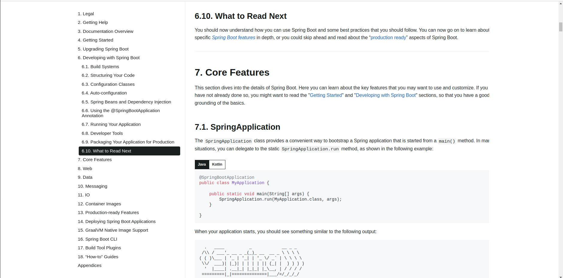
Before
After
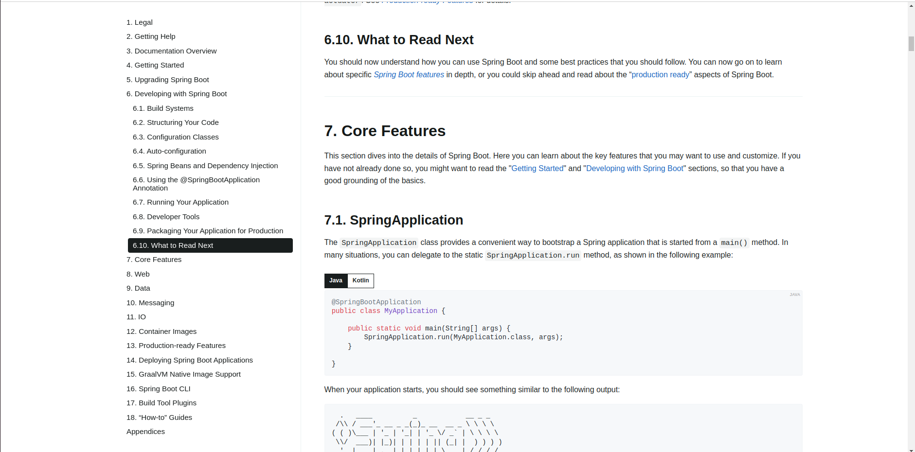
In here you can see that the sections are much more readable after adding the following css.
- I am using Ubuntu 22 as my OS and Chrome as my browser.
Comment From: philwebb
Could you please provide some before/after screenshots to show what you mean? What operating system and browser are you using?
Comment From: AlFahimBinFaruk
Could you please provide some before/after screenshots to show what you mean? What operating system and browser are you using?
I have updated the issue..
Comment From: wilkinsona
Thanks. The only difference that I can see is in the wrapping of the text. For example, in section 7.1 in the before image "in many situations" is split over two lines and where it wraps onto the second line the "y" in "many" is hidden and the n is only partially visible. In the after image, all letters are visible. Is this the problem that you're referring to? Interestingly, it does not occur for me in Chrome on macOS.
Comment From: AlFahimBinFaruk
Thanks. The only difference that I can see is in the wrapping of the text. For example, in section 7.1 in the before image "in many situations" is split over two lines and where it wraps onto the second line the "y" in "many" is hidden and the n is only partially visible. In the after image, all letters are visible. Is this the problem that you're referring to? Interestingly, it does not occur for me in Chrome on macOS.
Yes. That's the problem i am referring to. Most of the section with long description have the issue where some letters/words are hidden. I think this effects readability as its an doc. And i have also tried zooming in out the screen the issue remains the same..
Comment From: wilkinsona
@mhalbritter @scottfrederick do you see this on Linux?
Comment From: mhalbritter
Nope.
Fedora 39, Chrome Version 121.0.6167.160 (Official Build) (64-bit).
Comment From: scottfrederick
Mine looks like Moritz's on Ubuntu and Chrome. It responds appropriately to changes in window size also.
Comment From: wilkinsona
Thanks, both.
Looking more closely at this, even if we could reproduce it, I don't think padding the content is a good idea. Given that there's already a left and right margin of 2rem, adding padding of 1rem introduces unwanted extra whitespace. Furthermore, it leaves the content out of line with the heading at the top of each page.
@AlFahimBinFaruk I'm going to close this one as we cannot reproduce it and, unless we can do so, it won't be possible to figure out the right fix for it. If you can narrow down the problem and identify the circumstances that we'd need to reproduce the problem, please open an issue https://github.com/spring-io/spring-asciidoctor-backends where the CSS is maintained and we can take another look.