Thanks for adding anchors to the appendix (#8237).
This is a big improvement, but I wonder if it could be a bit more granular; for example Integration Properties covers many technologies and properties.
It would be nice if we could jump directly to rabbitmq or kafka instead of having to scroll past all the other properties.
Comment From: snicoll
I can see two ways we could fix this issue and both seems to lead to the creation of more tables. If we want to do this in a global fashion, perhaps our current description could have the notion of "sub-sections" so that we could do something like this:
.addSection("integration")
    .withSection("spring.activemq").withSection("spring.artemis").withSection("spring.batch") ...
That would create one sub-section under the current integration section with the same naming pattern (i.e. "spring.activemq properties") and a dedicated anchor.
If we don't want to go down that route, we could split things up a bit and just remove the high-level section and just listing the prefix one by one. In other words, remove the integration section and list only the prefixes. Doc output should help us decide what's best probably.
Comment From: garyrussell
It is not just the Integration section; I see a similar problem in the Data section with hundreds of properties covering many technologies.
https://github.com/spring-guides/gs-messaging-redis/issues/20#issuecomment-690656387
Comment From: Buzzardo
It would be good to be able to link directly to a property from other documents. You need not have a heading for each anchor. Inline anchors can go anywhere.
Comment From: wilkinsona
I've started working on something for this that will make each individual property linkable.
Comment From: wilkinsona
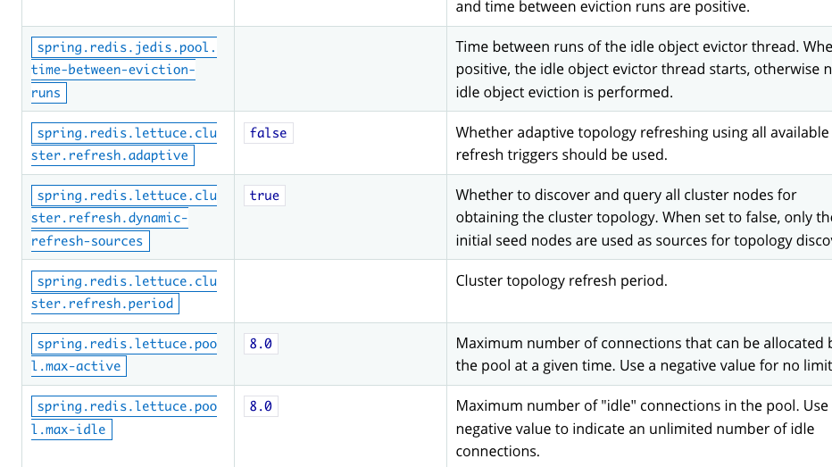
Each property in the 2.4.0 snapshot docs now has an anchor and is a clickable link. For example, here's spring.redis.host.
Comment From: garyrussell
Sweet - thanks @wilkinsona
Comment From: Buzzardo
Very nice. Thanks, @wilkinsona :)
Comment From: philwebb
Reopening because I'm afraid on Firefox it doesn't look the best. We might need some doc css updates.
Comment From: philwebb
Although I agree, it's a very nice feature!
Comment From: wilkinsona
It looks the same in Safari, I'm just less discerning than you. I think the main difference is that there's now a box drawn round each key. I think the CSS does that to any link where the text is monospaced (wrapped in `).
Comment From: wilkinsona
https://github.com/spring-io/spring-doc-resources/issues/48 needs to be addressed to fix this. We'll live with it in the meantime.