Hi pandas developers,
Is it possible to add violin plot as a built-in DataFrame method, along with bar plots, box plots, etc.? To be specific, I would like to have the following effect:
df = pd.DataFrame(______some_dataframe_with_four_columns___)
df.violin_plot()
And then I will be able to visualize the distributions of each four columns of df side by side, with column names being X axis label names.
Currently, Matplotlib supports generating violin plots from a transposed DataFrame, i.e.,
plt.violinplot(df.T)
but I need to write additional codes to set the X tick labels, therefore it would be great for pandas to add violin plot plotting as a native method.
By the way, although seaborn has a violin plot plotting function, that function does more things under the hood, for example, it aggregates all rows in a data frame by the categorical values of a certain column. This philosophy is not the same as pandas' plotting methods.
Comment From: gfyoung
cc @TomAugspurger
Comment From: TomAugspurger
Do you have an example dataframe? I'm curious why the transpose is needed.
Also, I would want this to have the same semantics as .boxplot which does aggregate over the data like seaborn, so could you clarify you last point?
Comment From: jsh9
Here is my example code:
import seaborn as sns  # just to load the "iris" dataset
import matplotlib.pyplot as plt

iris = sns.load_dataset('iris')
df = iris.iloc[:,:4]  # exclude the last column ("species")

plt.violinplot(df.T)
plt.xticks(range(1,df.shape[1]+1), df.columns, rotation='vertical')
This code example has no aggregating. Just plots the violin plot of each columns of df, and use their column names as X axis labels.
When I wrote my original post, I didn't notice that .boxplot can also do some aggregation. I guess implementing aggregation in .violinplot will also be great.
Comment From: mwaskom
btw
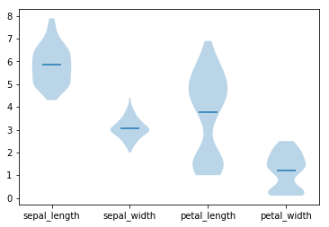
sns.violinplot(data=iris)
(also with iris.pipe((sns.violinplot, "data")))
Comment From: jsh9
IMHO, seaborn gives no warning when silently omitting the categorical column (i.e., species) in violin plots, which can be misleading. Explicit is better than implicit.
And violinplots being implemented in another package as a function does not mean that it need not be implemented here as a method. When I want to quickly visualize the distribution of a dataframe, and I don't want to load another package.
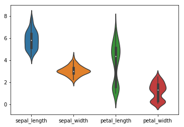
Also, I personally prefer the default violin plot colors of matplotlib (see below), and seaborn does not give me the option to "revert back" to matplotlib's violin plot style.
Comment From: TomAugspurger
@jsh9 if you're interested in submitting a PR adding violinplots, I think it'll be accepted.
IMHO, seaborn gives no warning when silently omitting the categorical column (i.e., species) in violin plots, which can be misleading.
Pandas will do the same thing here. We exclude non-numeric columns for most plots.
Comment From: mwaskom
I have no opinion on whether pandas also has a violin plot mode, just wanted to correct the false claim that seaborn can't use wide-form data.
Pandas will do the same thing here. We exclude non-numeric columns for most plots.
+1. Firing a warning when doing the thing that makes sense is more annoying than doing it implicitly.
Comment From: jsh9
Thanks for the clarification. I did not see the plotting example of sns.seaborn(data=iris) on the website, so I thought seaborn didn't have this.
Comment From: mroeschke
Seems since seaborn supports this pretty easily and there hasn't been much traction over the years to add this to pandas I'm to going to close for now, but happy to reopen if there's renewed interest