The Pain
Pandas is a powerful tool. If you are making a longer pipeline of chained operations there can be many arguments to provide. Often you want to try out different options. But that can take time to change the options and rerun the script.
Describe the solution you'd like
I would like to make the arguments interactive. With widgets. And eventually turn the pipeline into a small, interactive data app.
The solution is already here
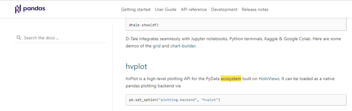
hvplot now provides the .interactive method to make dataframe pipelines interactive. Panel makes it easy to turn the pipeline into a small, interactive data app.
Basically what you can now make for example the seattle_bikes dataframe pipeline below interactive with widgets
# Widgets
resample = pn.widgets.Select(value="D", options=["D", "W", "M"], name="Sampling Frequency")
window = pn.widgets.IntSlider(value=50, start=10, end=100, name="Rolling Window Length")
center = pn.widgets.Checkbox(value=True, name="Center")
win_type = pn.widgets.Select(value="gaussian", options=[None, "gaussian"], name="Window Type")
std = pn.widgets.IntSlider(value=10, start=5, end=20, name="std")
line_width = pn.widgets.IntSlider(value=6, start=1, end=20, name="Line Width")

# A Pandas Dataframe made .interactive with hvPlot
pipeline = (
    seattle_bikes.interactive()
    .resample(resample)
    .sum()
    .rolling(window, center=center, win_type=win_type)
    .sum(std=10)
    .dropna()
)

# Interactive Plot
plot = pn.panel(
    pipeline.hvplot( # pandas .plot drop in replacement to render to Matplotlib, Bokeh or Plotly
        responsive=True,
        height=600,
        color=PALETTE,
        line_width=line_width,
        yformatter="%.0f",
    ).holoviews(),
    sizing_mode="stretch_both",
    name="Plot",
)

# Interactive Table
table = pipeline.pipe(
    pn.widgets.Tabulator,
    pagination="remote",
    page_size=20,
    theme="fast",
    sizing_mode="stretch_both",
).panel(name="Table")
https://user-images.githubusercontent.com/42288570/139597169-a60db679-ecbe-438b-b5f1-987f1ce0ef03.mp4
You can find the full code in this gist https://gist.github.com/MarcSkovMadsen/ffb273636dced88705c8c88d5ee28f23
You can use it in a notebook, colab, vs code, pycharm or where ever you explore and code.
Additional Resources

You may close this issue
I think this api is truly revolutionary and would like the world to know. Thus I shared the example here as I don't know where else this information can be shared in the Pandas community. You may close this issue.
Comment From: jreback
would take an addition of prose showing an example to the docs ; maybe in ecosystem or elsewhere
Comment From: MarcSkovMadsen
I think it could be added here. https://pandas.pydata.org/docs/ecosystem.html?highlight=ecosystem#hvplot.
I will try to make a PR.
Comment From: MarcSkovMadsen
I now have a notebook example I would like to somehow simplify to a PR
https://gist.github.com/MarcSkovMadsen/e666503df2aa1d8d047dcb9555b5da6d
https://user-images.githubusercontent.com/42288570/139733860-b69b026f-a4a6-4c57-8e88-9db6207d95e1.mp4
Comment From: MarcoGorelli
thanks for the issue
closing due to lack of activity, and hvplot is already linked in the docs