Not sure if possible to do in a generic way. But maybe will make sense once we have an OHLC aggregator implemented
Comment From: esthers
Yes please implement candlestick plotting for DataFrame. It is so nice to make instant plots of financial data from yahoo with pandas but candelstick charts for many, like me, really are a must to analyze the data.
Comment From: wesm
I'd be happy to accept a pull request for this
Comment From: dalejung
I have this here: http://nbviewer.ipython.org/4982660/
In order to support financial data I send mpl an ordinal index, essential np.arange(len(df.index)) and draw the ticks with a Locator/Formatter. Doing this with DatetimeIndex actually speeds up plotting https://github.com/pydata/pandas/issues/1579 and gets rid of weekend gaps. However, a side effect of this is that you have to keep the previous data around for future plots on the same axes. For that I have a Figure class that handles translating any future plots into an ordinal index. I chose to keep all plotted data around for plot specific fillnas, but that's probably unnecessary.
I'd like to merge this stuff in but I'm not sure how compatible it is. trtools.charting is fairly heavy handed in assuming you're not touching matplotlib directly. Mixing ordinal and datetime index plots on the same axes wouldn't work.
The module itself is self-contained outside of a small column_grep utility, so it can be made to be cleanly import-able as an add-on.
Comment From: esthers
@dalejung, if you could find a way to merge your code it would be greatly appreciated.
Comment From: woodb
@dalejung, have you had any luck implementing this?
I agree that importing a big library for something like a candlestick plot seems heavy handed, maybe there's a lighter weight way we can get this going.
Comment From: woodb
@wesm, how do you think this should work syntactically?
Rolling this functionality into plot might be neat.
For example, if the DataFrame has a datetime index and columns "open", "high", "low", "close", and a DataFrame.plot() is called, would it make sense for the result to be a candlestick plot by default?
Would this be better as a kwarg for DataFrame.plot() or as a separate function (e.g. ohlc_plot)
Comment From: dalejung
@woodb Sort of. I split out the charting work into its own project https://github.com/dalejung/ts-charting. The heaviness was due to me keeping the plotted data around in a DataFrame. I was doing this to use the DataFrame.__setitem__'s auto-reindexing to keep the plots aligned. I'm a bit smarter now and keep only index around.
I think ts-charting should be straight-forward to merge into pandas, at least a portion of it. When I get the time I'll open a PR.
Comment From: woodb
@dalejung Prima, let me know if you need any help, I've got some time here and there.
Comment From: dalejung
@woodb Actually, a smaller first pass could be done with http://nbviewer.ipython.org/5864433. That uses the matplotlib datetime handling.
ts-charting converts the DatetimeIndex to ints and translates the labels back with a custom Formatter. I'm pretty sure this could be made pandas compatible by always checking the current ax for our TimestampFormatter and reindexing to the current x-axis. I suppose the Figure and Grapher classes would need their methods refactored into flat functions or hidden away onto the Formatter.
Converting to an int-index is better but it means that every plot to that ax will need the translation. It's convenient to call fig.hl_span("2012-01-02", "2012-01-05"), but the base matplotlib method would not work ax.axvspan("2012-01-02", "2012-01-05") unless I monkey patched it.
Actually, thinking about it more. I dunno if that's acceptable for inclusion into pandas. Part of the reason for the Figure abstraction is to create a namespace where all methods are aware of the Datetime -> int translation. hm.
Go Gators??!
Comment From: phobson
Thought y'all might be interesting in this: https://github.com/matplotlib/matplotlib/pull/2643
If merged, you'll be able to feed a matplotlib axes object a list of dictionaries "stats" describing the boxplots via a bxp method
Comment From: ghost
Thanks @phobson. Worth noting that mpl already has candlestick support pretty much baked in, But it's planned for removal in a future release?
Comment From: phobson
@y-p -- yeah. What I've heard is that matplotlib.finance will be deprecated in mpl 1.4 and removed by 1.5.
Comment From: ghost
@phobson , is it getting a new home or will the code just be thrown away? The fragmented state of python viz has been coming up in issues here lately. The situation is eerily similar to wes's old post on the fragmented state of data libraries in python, hoping for a similar turn for the better.
Comment From: jreback
@phobson new champion for a combined viz library? (built on pandas of course) :)
Comment From: jtratner
I was discussing this out of band with @olgabot. @mwaskom 's seaborn could be a good candidate (and it already appears to use pandas).
Comment From: phobson
@y-p I can't say for certain what the final fate of it is. My impression, however, is that it'll be thrown out.
Personally, I think pandas/pydata people/we should be equally supporting/endorsing/contributing to seaborn and python-ggplot.
I got in early on matplotlib straight from using matlab during my stint in academia -- which is to say I'm comfortable using it directly and I probably won't ever get my head around ggplot-esque APIs. However, I think having both styles of API is crucial to growing the python-science/data/viz community.
Comment From: ghost
poignant comment made a few days ago re two valid approaches: mpl recipes vs. ggplot. I don't know which library will come out on top (hopefully both), but we should encourage viz PRs to join forces with existing efforts rather then pandas sapping work away IMO.
Note: @phobson just beat me to it :)
Comment From: jtratner
@phobson - yeah, definitely think both are good efforts. I find ggplot really confusing personally (but that's probably because I started with mpl).
Not totally clear where that leaves us in terms of the visualization PRs we
currently have. If we were to change the plot functions to lookup kind
with a dictionary, it'd be relatively easy for others to hook into the
pandas plot method (not sure if that's actually desirable though)
Comment From: olgabot
So should I move heatmap to seaborn (or at least suggest it with a PR)
to keep with this theme?
Olga Botvinnik PhD Program in Bioinformatics and Systems Biology Gene Yeo Laboratory | Sanford Consortium for Regenerative Medicine University of California, San Diego olgabotvinnik.com blog.olgabotvinnik.com github.com/olgabot
On Mon, Dec 16, 2013 at 9:56 AM, y-p notifications@github.com wrote:
poignant comment made a few days ago re two approaches: mpl recipes vs. ggplot. I don't know which library will come out on top, but we should encourage viz PRs to join forces with existing forces rather then pandas sapping effort away IMO.
— Reply to this email directly or view it on GitHubhttps://github.com/pydata/pandas/issues/783#issuecomment-30683347 .
Comment From: ghost
You might, I've been thinking of doing the same thing except targeting ggplot.
Comment From: wesm
Won't fix
Comment From: femtotrader
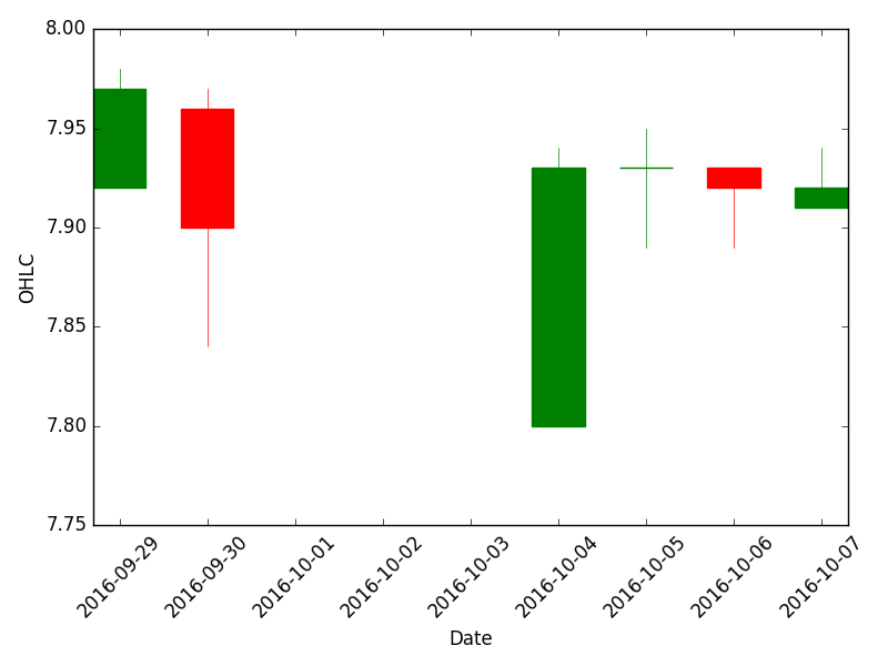
Some basic code to display daily OHLCV data
import pandas as pd
from pandas.compat import StringIO

import matplotlib.pyplot as plt
from matplotlib.finance import candlestick_ohlc
import matplotlib.dates as mdates

def plot_candlestick(df, ax=None, fmt="%Y-%m-%d"):
    if ax is None:
        fig, ax = plt.subplots()
    idx_name = df.index.name
    dat = df.reset_index()[[idx_name, "Open", "High", "Low", "Close"]]
    dat[df.index.name] = dat[df.index.name].map(mdates.date2num)
    ax.xaxis_date()
    ax.xaxis.set_major_formatter(mdates.DateFormatter(fmt))
    plt.xticks(rotation=45)
    _ = candlestick_ohlc(ax, dat.values, width=.6, colorup='g', alpha =1)
    ax.set_xlabel(idx_name)
    ax.set_ylabel("OHLC")
    return ax


data="""Date,Stock,Open,High,Low,Close,Volume
2016-09-29,KESM,7.92,7.98,7.92,7.97,149400
2016-09-30,KESM,7.96,7.97,7.84,7.9,29900
2016-10-04,KESM,7.8,7.94,7.8,7.93,99900
2016-10-05,KESM,7.93,7.95,7.89,7.93,77500
2016-10-06,KESM,7.93,7.93,7.89,7.92,130600
2016-10-07,KESM,7.91,7.94,7.91,7.92,103000"""
df = pd.read_csv(StringIO(data), index_col='Date', parse_dates=True)

ax = plot_candlestick(df)

print(ax)

plt.tight_layout()
#plt.savefig("candle.png")
plt.show()
Related SO questions: - http://stackoverflow.com/questions/33066714/display-csv-with-candlestick-ohlc - http://stackoverflow.com/questions/35677173/charting-with-candlestick-ohlc
Comment From: jreback
@femtotrader you are just plotting a box-plot.
http://pandas.pydata.org/pandas-docs/stable/visualization.html#box-plots
Comment From: femtotrader
An example of box-plot with such a DataFrame will be nice.
I tried
df[["Open", "High", "Low", "Close"]].transpose().plot.box()
and get
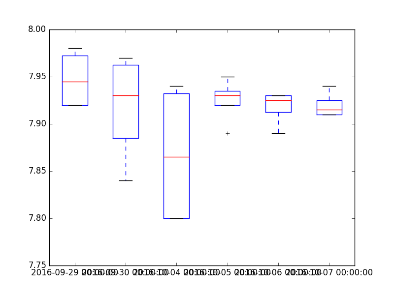
It doesn't look very well