Would it make sense to add functionality for coloring bar charts according to a categorical value in a column? It could then by be passed as an argument such as:
df.plot(kind='bar', colors=['r', 'g', 'b'], color_by=['B'])
which would lead to ['r', 'g', 'b'] being cycled throughout the values in column 'B'
Something along the lines of:
def color_by_category(series, colormap):
        from itertools import cycle
        unique_categories = set(series)
        color_cycle = cycle(colormap)
        repeat_colors = [color_cycle.next() for i in range(len(unique_categories))]
        category_color = {i:j for i,j in zip(unique_categories, repeat_colors)}
        color_array = [category_color[k] for k in series]

        return color_array
Comment From: sinhrks
Can't imagine how it works. Pls show sample data and expected image?
Comment From: szeitlin
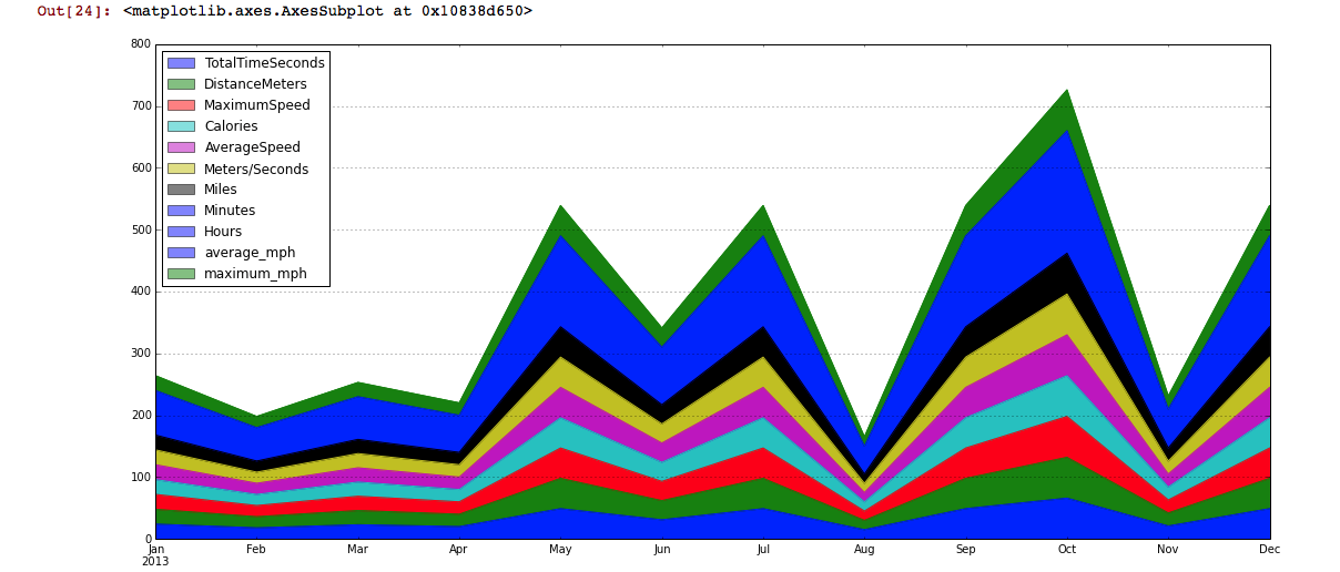
I have to second this request, since it would fix a related problem: currently (version 0.14), the legend colors don't actually match the ones that show up in the graph. Thus, it is impossible to tell which category is which, and if you have more than a few categories, with the default settings, the colors quickly repeat. Screenshot is attached for an example - there are at least 2 categories that show up as medium blue in the graph, and I don't see either of them in the legend, although I suspect they're among the purple boxes? And the two green categories appear identical in the plot (and their order doesn't match the legend, either). FWIW, I noticed the same thing is also true in the example in the docs (http://pandas.pydata.org/pandas-docs/stable/visualization.html)
my example:
the docs (where the colors are closer, but not matching - I'm guessing it's something with an alpha layer/transparency issue)?
Comment From: sinhrks
@szeitlin Let me summarize, you mean 2 issues? :
Plot has the legend colors don't actually match the ones that show up in the graph.
This is a bug which area sets incorrect alpha value on legend when stacked=True. I'll fix this.
If you have more than a few categories, with the default settings, the colors quickly repeat.
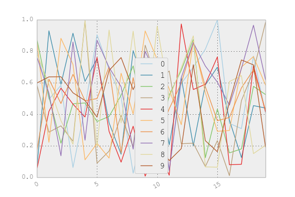
Default has 7 colors (['b', 'g', 'r', 'c', 'm', 'y', 'k']). You can specify cmap if you want to use more. Or, specify individual color values by color keyword.
df = pd.DataFrame(np.random.rand(20, 10))
df.plot(cmap='Paired')
Comment From: szeitlin
Sinhrks mailto:notifications@github.com August 13, 2014 at 6:08 PM
@szeitlin https://github.com/szeitlin Let me summarize, you mean 2 issues? :
Plot has the legend colors don't actually match the ones that show
up in the graph.
This is a bug which |area| sets incorrect |alpha| value when |stacked=True|. I'll fix this.
Awesome, thanks.
If you have more than a few categories, with the default settings,
the colors quickly repeat.
Default has 7 colors (|['b', 'g', 'r', 'c', 'm', 'y', 'k']|). You can specify |cmap| if you want to use more. Or, specify individual color values by |color| keyword.
|df = pd.DataFrame(np.random.rand(20, 10)) df.plot(cmap='Paired')| Yes, after much digging I found mpltools.style (which I guess will now be included in matplotlib 1.4, I'm still on 1.3). I got that to work with a list of numbers and some guessing. Not ideal.
I think it's worth noting that it would be nice to have an easier way to set a whole range of colors in pandas, since most data sets in pandas will, if you're using a dataframe, probably have more than 7 different variables.
I suspect it's a feature that many people would appreciate having, e.g. color sets with 12 or 24 colors might be convenient (I'm thinking crayola box sizes...)?
sam
figure_1 https://cloud.githubusercontent.com/assets/1696302/3914838/d29db578-234e-11e4-957c-056862fb2b83.png
— Reply to this email directly or view it on GitHub https://github.com/pydata/pandas/issues/7636#issuecomment-52132507.
Comment From: szeitlin
we should think about porting this over to python (this kind of stuff is why people like R): https://github.com/cttobin/ggthemr
Comment From: sinhrks
Interesting. I believe there is similar color modules in PyPI already, and you can pass generated colors to plot functions. Personally I can't tell from 10 or more colors though... :)
Comment From: tanimislam
This is how I interpret this new functionality for plotting bar graphs in Pandas. Say that you want to color the y by its value, which can look like this.
Comment From: jreback
matplotlib cycler is supported for some time