You can already kind of do this by passing in the numpy array
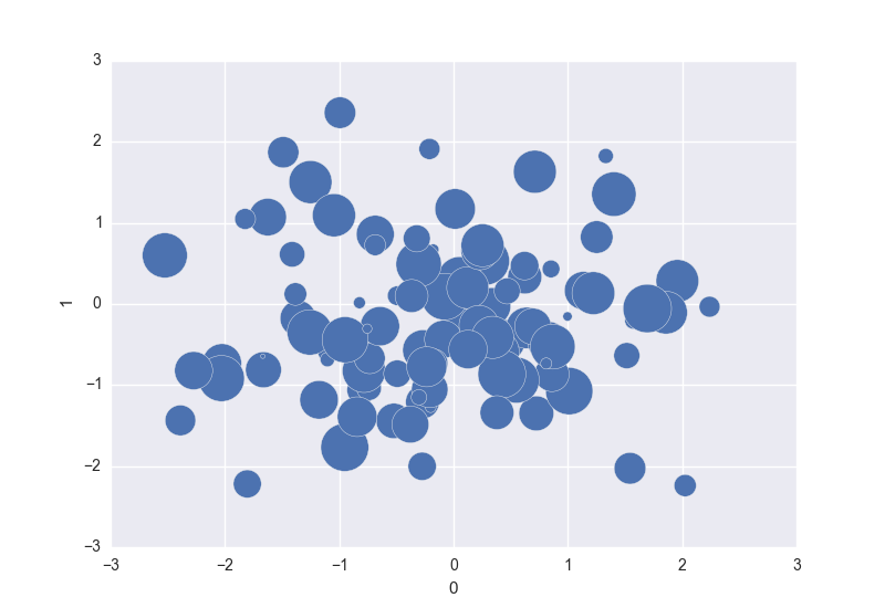
In [83]: df = pd.DataFrame(np.random.randn(100, 2))

In [84]: df['z'] = np.random.uniform(size=(100))

In [85]: df.plot(kind='scatter', x=0, y=1, s=df.z.values * 1000)
Out[85]: <matplotlib.axes._subplots.AxesSubplot at 0x11a81df60>
But when I merge https://github.com/pydata/pandas/pull/7780/ (coloring by column) it would be natural (and awesome) to do df.plot(kind='scatter', x='x', y='y', c='color', s='size')
Shouldn't be too hard if we're willing.
Comment From: shoyer
The reason I didn't do this in #7780 is because, unlike coloring by column, you need to have "size" in the right units to make the result look reasonable. So we would need to invent another argument (e.g., s_scale) to adjust printer points to the right size. We could pick some sort of sane default based on the statistics of the "size" column. Possibly would be worth looking at how ggplot handles this.
Comment From: jorisvandenbossche
@TomAugspurger Something else, which matplotlib style did you use in the plot above? I think the plots in out docs should look like that! Is it a style that you can express in rcParams, then we could update https://github.com/pydata/pandas/blob/master/pandas/tools/plotting.py#L34 (eg the grid lines -> white lines)
Comment From: shoyer
@jorisvandenbossche This is the style you get from importing seaborn. Just import seaborn should do it.
By the way, if you haven't tried Seaborn, you should definitely check it out. It's has a very well thought out design (both the API and the graphics style).
Comment From: jorisvandenbossche
Ah, OK. Yes, I know seaborn, but have not yet really used it. In any case, we could maybe copy some the rcParams to update the style of the plots in our docs.
Comment From: onesandzeroes
The seaborn style looks like it's just ggplot's default style. It's one of the built in styles in matplotlib 1.4, so if you wanted to use that for the docs, then you could just do:
import matplotlib.style
matplotlib.style.use('ggplot')
Comment From: onesandzeroes
Also, at first glance the way ggplot handles this doesn't seem super complicated, it seems like it's all done here. So basically, it sets up a range between 1 and 6 (units are arbitrary, we'll just have to pick a range that looks good I guess) and normalizes the values to that range.
The main difference is that I think ggplot is scaling based on the radius, whereas matplotlib markersize sets the area, so we might need to transform? There's a bit of discussion on SO here, the scaling in the second example looks quite good.
Comment From: onesandzeroes
To me, the sizes seem pretty good if we just pick sensible defaults for the min and max point size, and then normalize the values to that range, e.g.:
import pandas as pd
import matplotlib.pyplot as plt
import numpy as np

def convert_to_points(vals, size_range=(50, 1000)):
    min_size, max_size = size_range
    val_range = vals.max() - vals.min()
    normalized_vals = (vals - vals.min()) / val_range
    point_sizes = (min_size + (normalized_vals * (max_size - min_size)))
    return point_sizes

df2 = pd.DataFrame({
    'x': np.linspace(0, 50, 6),
    'y': np.linspace(0, 20, 6)
})
df2.plot(kind='scatter', x='x', y='y', s=convert_to_points(df2.x.values))
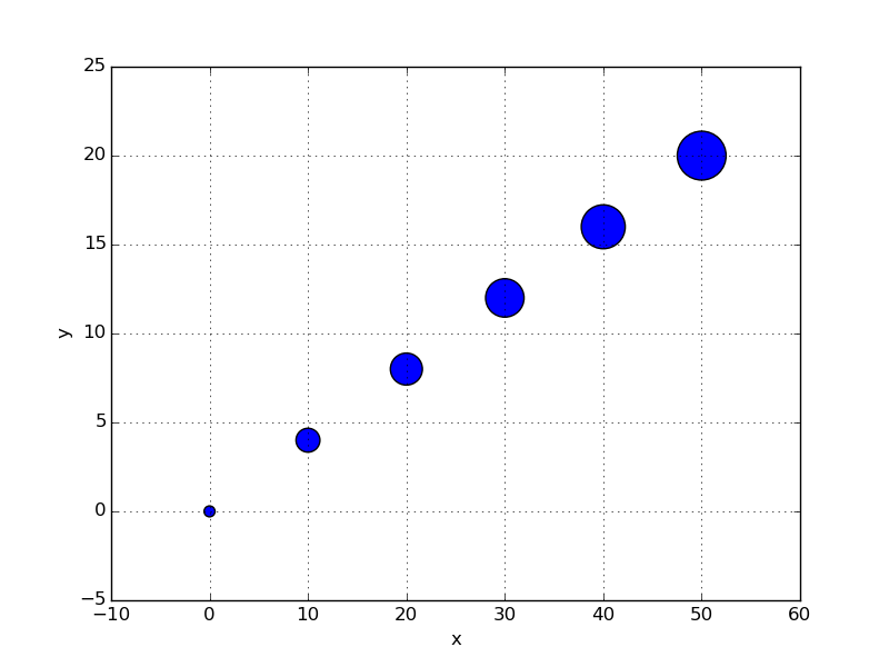
I can't claim to have the best eye for visual design though, so if anyone can suggest scaling methods that work better than a straight linear transform I'm happy to hear them. If the aim is to provide an argument that lets people adjust the min and max size up and down, it might also be nice to present the user with more sensible numbers like ggplot does with its default (1, 6) range
Comment From: TomAugspurger
Dupe of https://github.com/pandas-dev/pandas/issues/16827